I was a discussant at the London launch of the World Inequality Report 2018 last week by the WIR team’s Lucas Chancel. (The book, that is – the online version was released in December)
The WIR is produced by a team of economists who contribute to the WID.world database, of whom the biggest rock star is Thomas Piketty. The database is laudably transparent and user-friendly, and scrapes lots of different sources to try and build as comprehensive a picture of inequality as possible. That means national income and wealth accounts (including, when possible, offshore wealth estimates); household income and wealth surveys; fiscal data from taxes on income; inheritance and wealth data (when they exist); and wealth rankings. Phew.
The findings are striking:
‘Inequality has increased in nearly all world regions in recent decades, but at different speeds’. See Fig 2A. But fellow panellist Paul Segal pointed out that if you look closer at that graph you find another interesting development – the rate of increase of inequality has fallen since the mid-2000s, and inequality is now falling in most countries. But we’re not quite sure why, or whether it is a long term trend, or a short-term blip caused by e.g. the financial crisis.

In regions of the world like the Middle East, India and Brazil that did not experience a ‘great compression’ of inequality in the 20th Century (which went into reverse roughly up to 1980), you see something that looks like a natural ‘inequality frontier’, where the top 10% trouser about 60% of national income. That may be where Europe, US and China are now headed (see Fig E2b). Open question whether that frontier is static or rises over time as economies grow.
A really interesting discussion on the inequality impact of private v public ownership, a debate that the report acknowledges is an unusual combination of macro and micro:
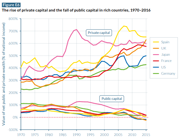
‘Economic inequality is largely driven by the unequal ownership of capital, which can be either privately or public owned. We show that since 1980, very large transfers of public to private wealth occurred in nearly all countries, whether rich or emerging. While national wealth has substantially increased, public wealth is now negative or close to zero in rich countries. Arguably this limits the ability of governments to tackle inequality; certainly, it has important implications for wealth inequality among individuals.’
All really interesting, but (there’s usually a but), as I read the paper and looked at all the charts on powerpoint, I started to have my doubts.
Firstly, my mind went back to those conversations back in 2013 at Twaweza, a great East African NGO that had assumed that putting information (in this case on the appalling state of education in East Africa) into the hands of the public would lead the public to take action. It didn’t. Cue a fascinating bit of heart searching about the limits to access to information.
Might WIR face a similar problem – in what circumstances will endlessly expanding, improving and cleaning up data lead people to take action on inequality? After all, giving climate change deniers more information about climate change actually deepens their opposition to doing anything about it. The assumption that data leads to action really needs to be looked at in more depth.
And the report was frustrating because although it is superficially political (lots of Piketty-esque barbs about how much better Europe social democracy performs than the USA), it never really gets beyond recommending some fairly standard policies (progressive taxes, prevent tax evasion, invest in education, inheritance tax). There’s some kind of implicit assumption in here that decision makers at some point will want to tackle inequality, even if it courts unpopularity (eg on inheritance tax) and will be strong enough to resist the inevitable backlash from those who lose out. That’s a big tin opener.
What it doesn’t do is even ask if any of the policies proposed are politically feasible, or what might be needed to make them so. The memorable caricature of NGO reports as ‘bad shit; facty, facty’ now becomes ‘bad shit; facty facty; policy solutions; no politics’. Is that really good enough?
When I briefly ranted on to this effect, Lucas reasonably enough said that his crew of economists couldn’t be expected to do everything, and this was someone else’s job (power analysis, stakeholder mapping, building coalitions, seizing windows of opportunity and all the rest). The problem with that answer is a) there seems to be an imbalance between the academic effort to measure, and the academic effort to design feasible change strategies and b) if you combine the two, rather than treat them as distinct stages, you are likely to think design the research differently to have impact. For example, if you want to influence decision makers in country X, you may want to compare it particularly to its annoying neighbour Y, not some country thousands of miles away that it doesn’t care about.
Anyone seen any good reviews and crits of WIR?